St James Church
A modern visual identity for a growing, community-focused church.
The Brief
St James Church had outgrown its original logo, which was a detailed illustration of the church building and wasn't versatile enough for modern applications or communicating the wider character of the church.
The new identity needed to feel alive, welcoming and community-focused, helping St James connect with new people and families in the local community. It needed to move away from traditional church imagery while still incorporating the cross and a subtle reference to the church's distinctive tower.
Deliverables:
Logo Suite
Font pairings and colour palette
The Strategy
With growth at the heart of the brief, the identity needed to reflect a church that was rooted in faith but growing outward into its community. The requested leaf/tree motif provided a strong way to express this idea, but needed to be handled carefully alongside the existing green colour palette so the identity didn't feel like an environmental brand.
The Solution
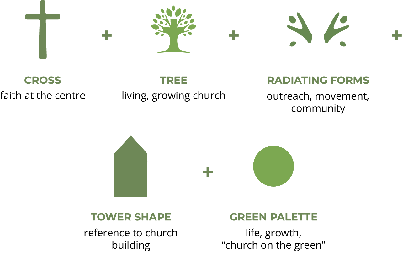

The final identity brings these ideas together through a stylised tree structure, with the cross at its centre and subtle references to the church tower within the form. Rather than depicting each element literally, they are simplified into one flexible symbol that feels contemporary and distinctive.
Original logo


New logo
The Outcome
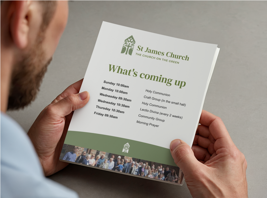
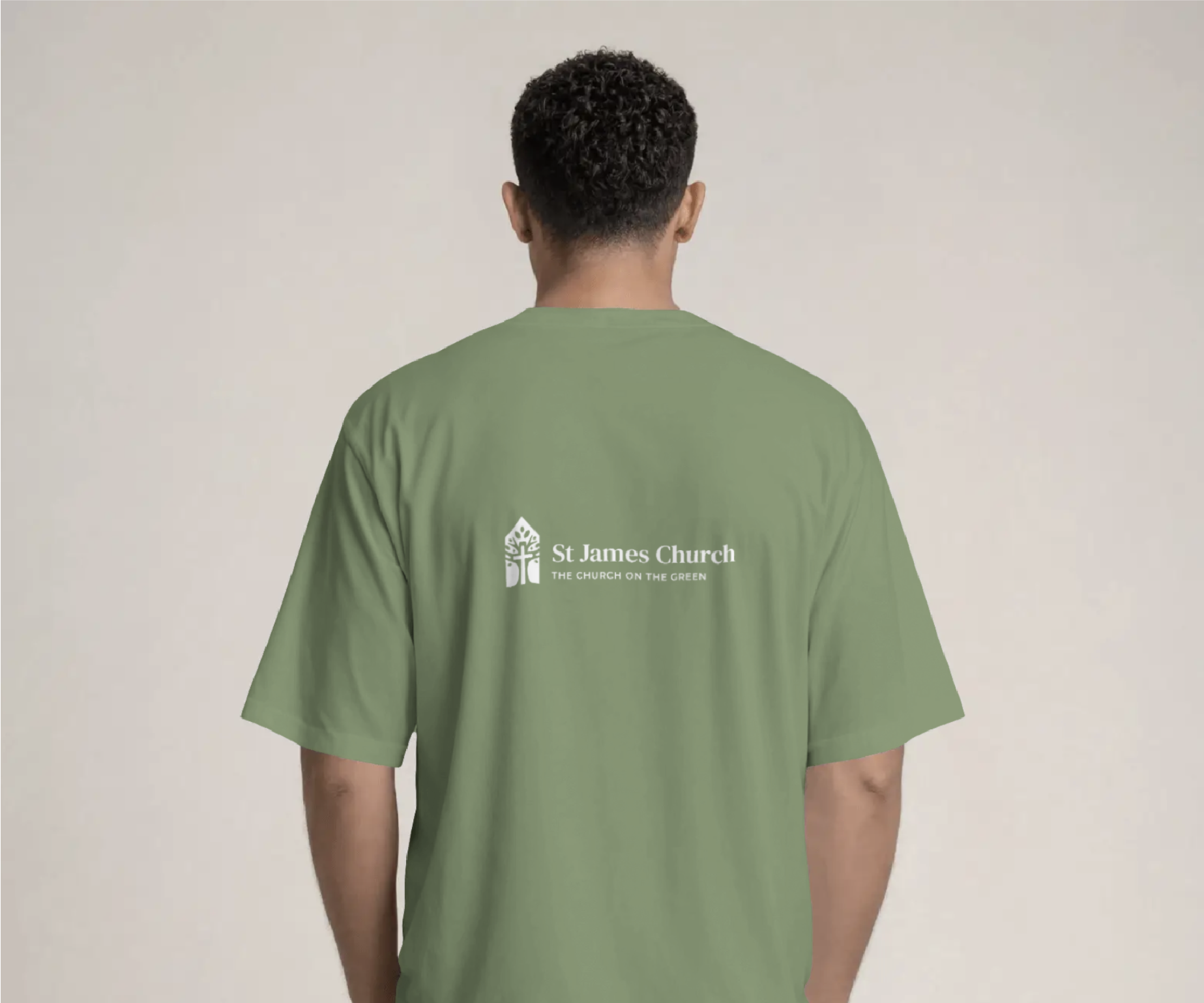
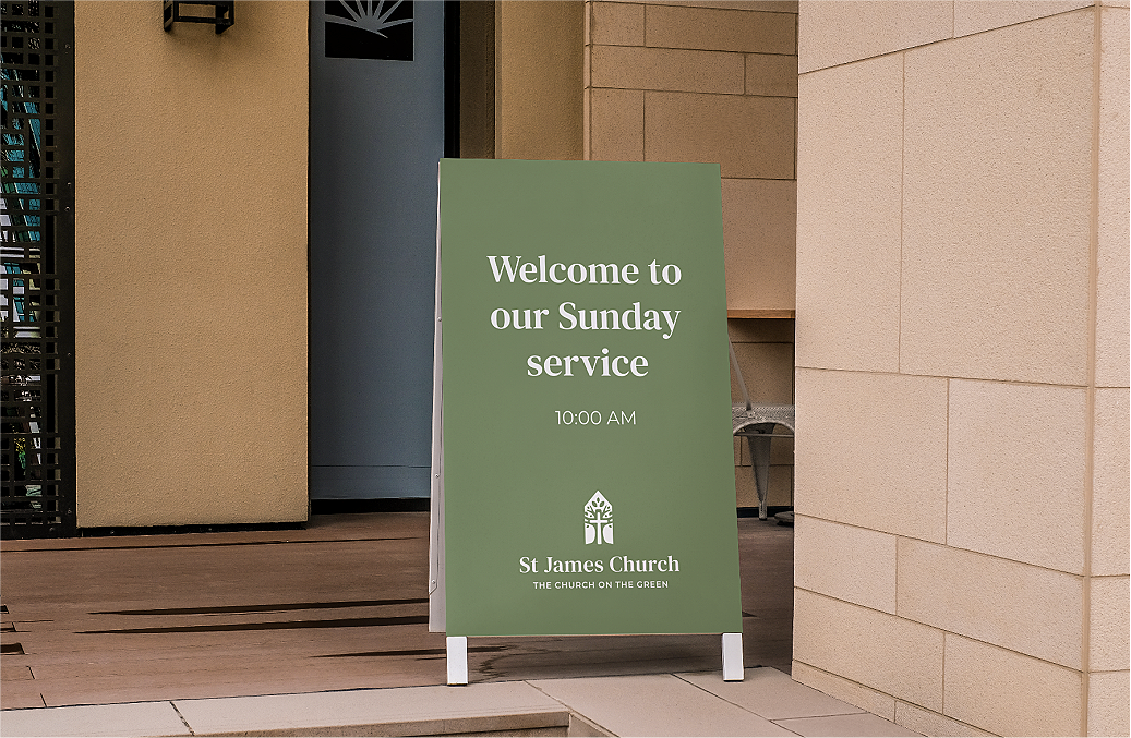
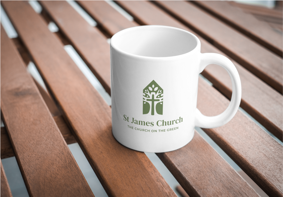
The new identity gives St James Church a more contemporary and flexible visual presence, while keeping faith and community at its centre. The system can be applied consistently across print and digital materials, helping the church communicate a sense of growth, connection and welcome.