Lara’s Little Dreamers
A new visual identity for a pediatric sleep specialist supporting expat families across Europe.



The Brief
Lara's Little Dreamers supports parents of babies and toddlers who are raising their families away from their usual support networks. As a new business, the client needed a brand that felt professional and trustworthy while still reflecting the warmth and reassurance at the heart of her work.
The Strategy
Sleep support can easily feel clinical or instructional. For parents who are already exhausted and sometimes isolated, we wanted the brand to communicate something different: connection.
Connection between parent and child, between a child and their ability to rest, and between parents and the support they need.

The Solution
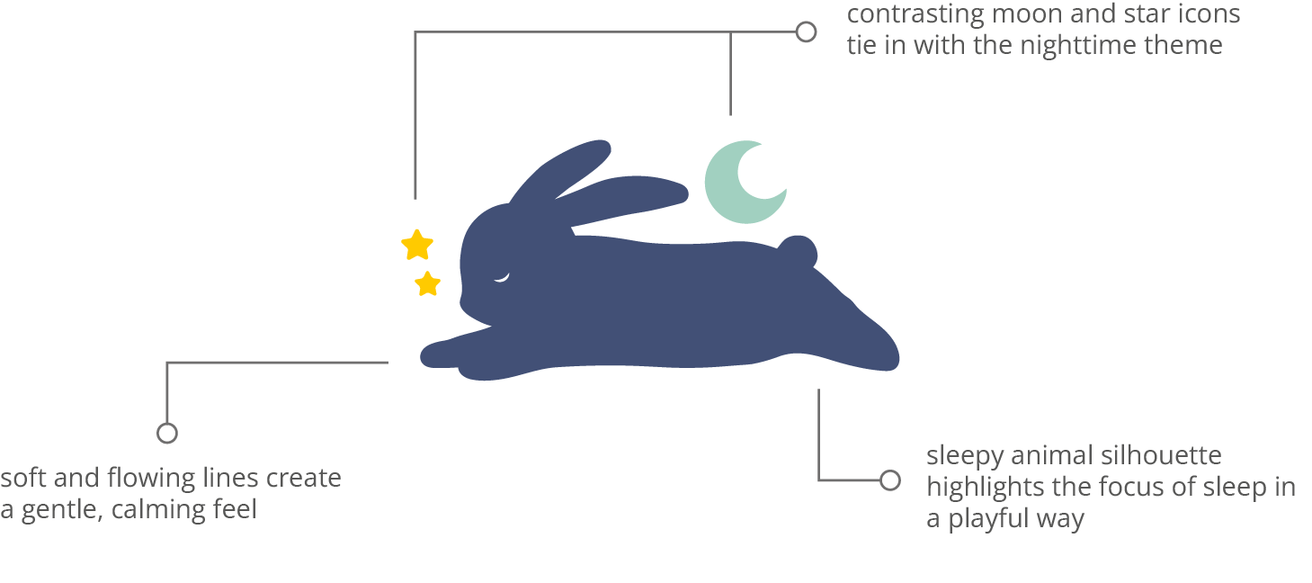
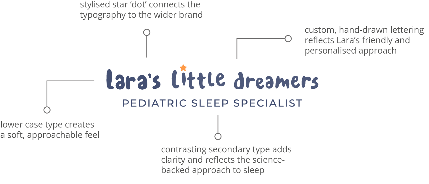
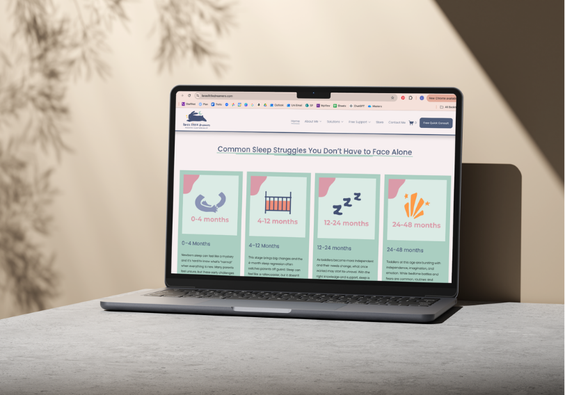
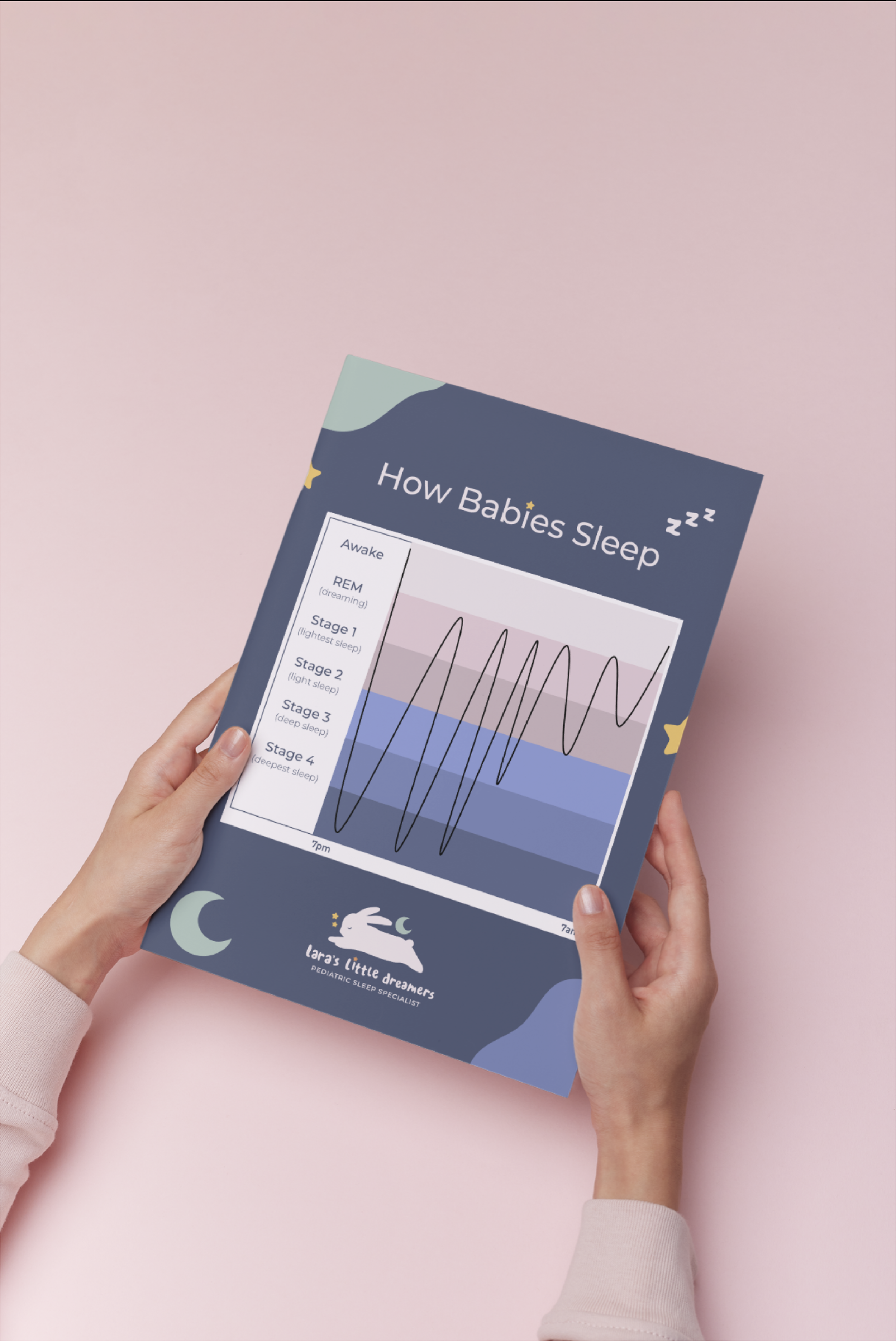
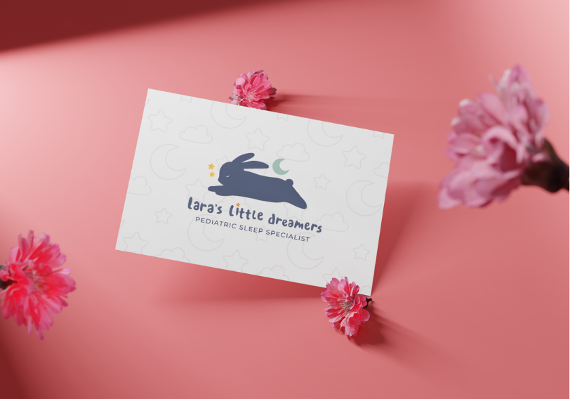
The identity combines a calm, approachable visual language with playful details that reflect the world of young families.
A soft colour palette, custom-drawn typography and illustrated elements create a brand that feels nurturing without becoming overly childish, while considered structure and deeper tones maintain a sense of trust and expertise.
Deliverables:
Logo + variations
Custom typography & colour palette
Illustrated icon set
Instagram highlight icons + templates
PowerPoint & Word templates


Colour Palette
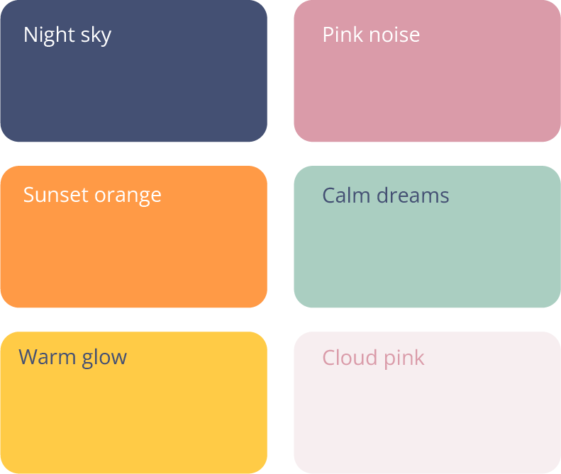
The colour palette combines soft, playful tones with deeper, grounding shades to create a brand that feels reassuring, approachable and full of warmth.
Together, the colours avoid a clinical or overly corporate feel, creating an identity that feels both professional and comforting for families.

Brand in action



What the Client Said
"Super friendly, professional, efficient, and great communication — you got me and my brand!" — Lara, Founder