White Wolf Athletics
A bold, minimalist identity for an athletic brand focused on structured training and measurable performance.


The Brief
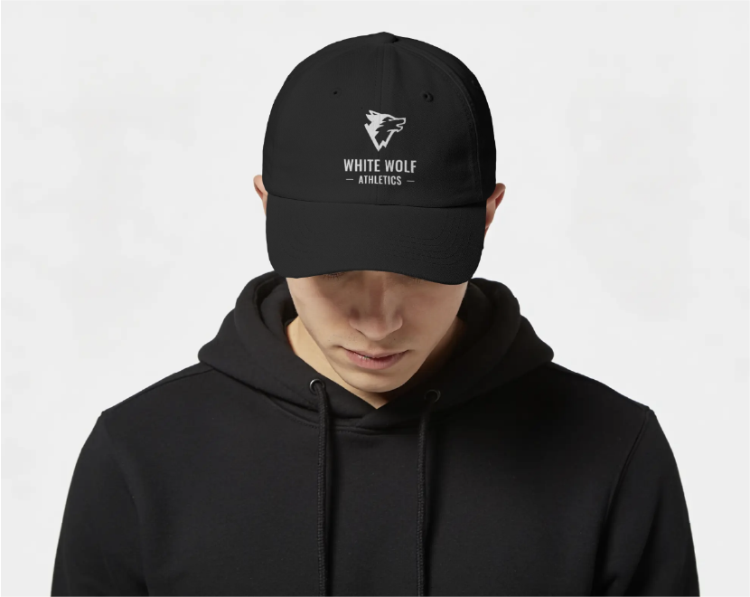
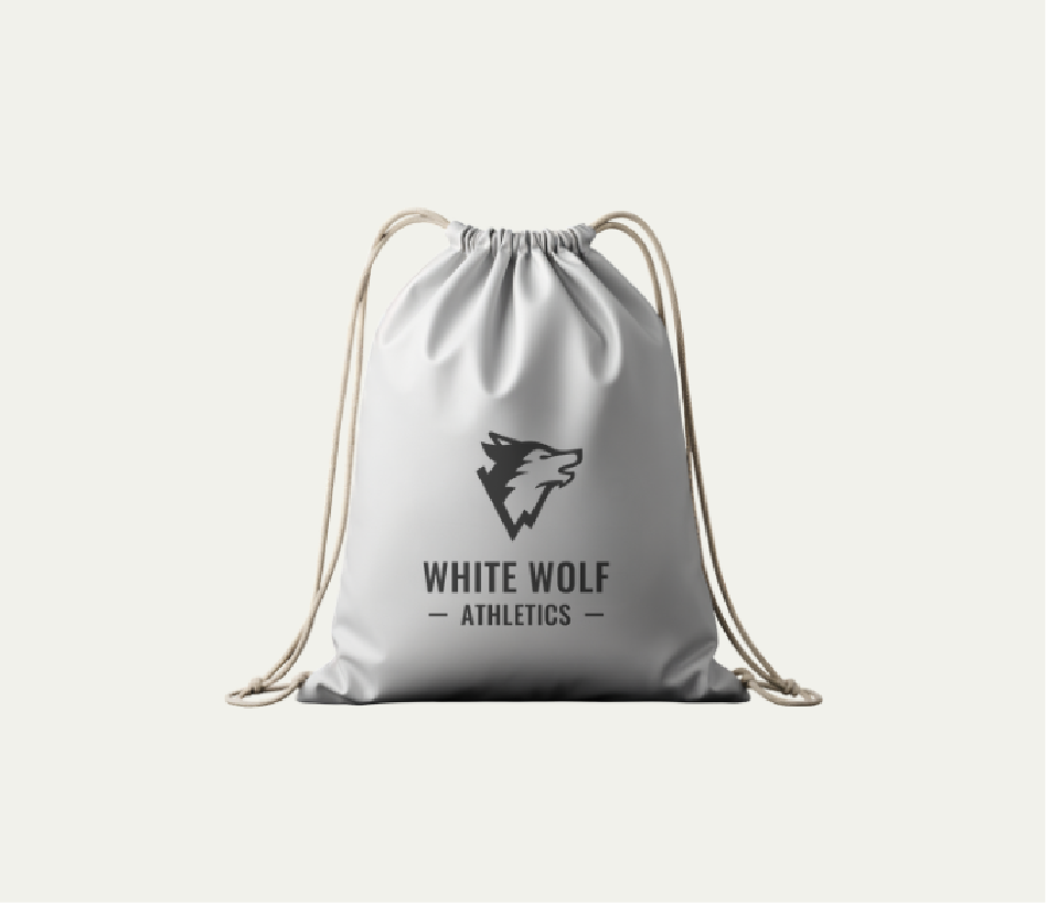
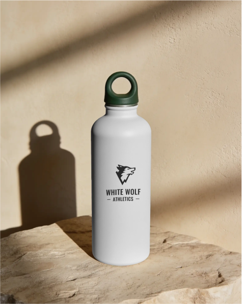
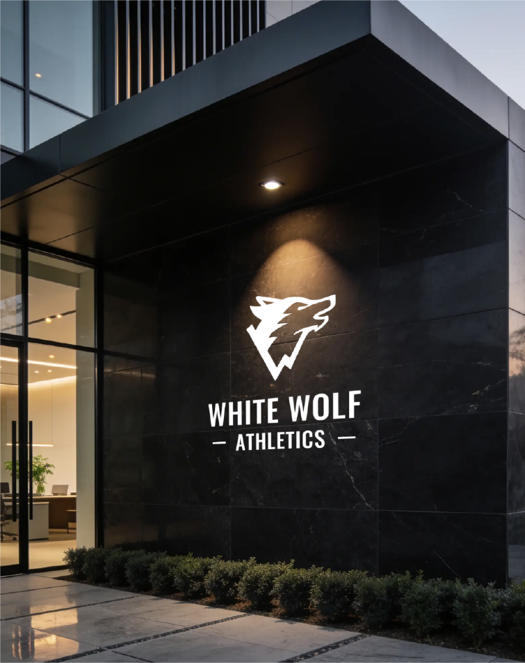
White Wolf Athletics needed a visual identity that felt powerful and modern while balancing intensity with discipline and control. The brand needed to work across digital products, training materials, gym environments and apparel.
The Strategy
The identity needed to communicate controlled power, progression and performance.
The wolf provided a strong foundation, but needed to feel distinctive rather than intimidating or overly literal. The visual direction focused on sharp, purposeful forms and a restrained black-and-white palette to create a bold identity with a disciplined edge.
The Solution
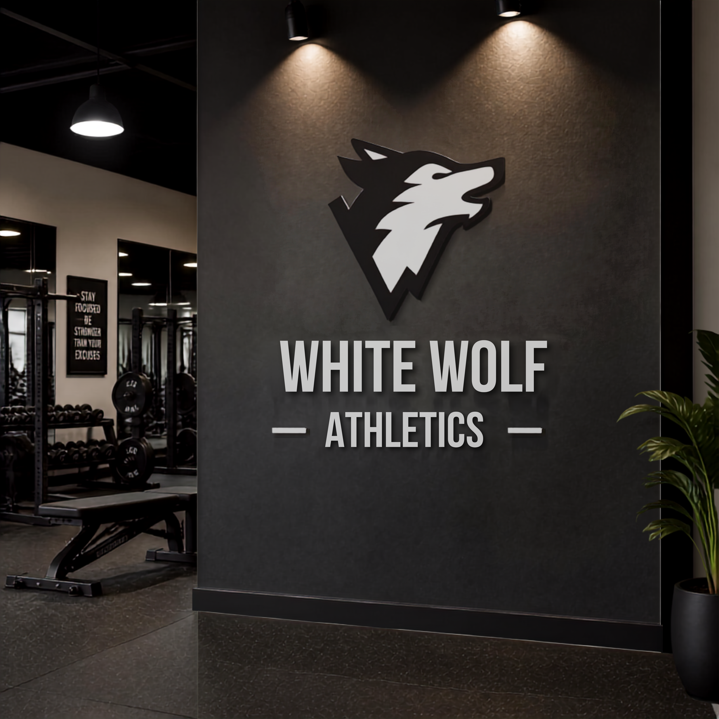
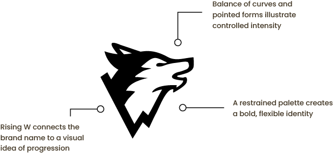
A clean wolf head emerges from a rising W shape, combining the brand name with a subtle reference to progression.
The asymmetrical form takes inspiration from performance charts, reinforcing ideas of measurable results and continuous improvement.
The balanced black-and-white construction allows the identity to work seamlessly in both positive and reversed applications.
Deliverables:
Logo + variations
Font pairings and colour palette
The Outcome
The resulting identity gives White Wolf Athletics a distinctive visual foundation that balances power with control. The flexible logo system and restrained black-and-white palette allow the identity to work consistently across training materials, digital applications, apparel and gym environments.